Using Color As a Mood Enhancer
22nd Jan 2020
While you’re busy rejuvenating yourself this month, keep in mind an easy way to do that is to use color to your advantage. Whether you use this info to refresh a room, your wardrobe, or your lingerie drawer, a basic understanding of color theory can help you use color in small ways to make a big impact.
Ever notice how a space influences how you feel? Color affects our mood and emotions, and understanding the basics of why, you can use it to your advantage. There is a reason spas often use a palette of cool blues and greens (soothing), and restaurants often use yellow plates (said to inspire hunger).
Colors impact people in varying ways depending on past associations and how your brain processes those hues. The color psychology guide below includes the most common color and mood associations, so you can decorate based on how you’d like each room in your home to feel. Keep in mind that various tones of the same color will evoke different moods. Take blue for example, a cool beach-y blue is said to be great for relaxing spaces, while a deep navy is still intimate and cozy but more formal. You can also use warm or cool shades of the same color to change the ambiance and feeling a space conveys.
Check out the most common color and mood associations below, so you can dress or decorate based on the emotions you'd like to evoke or convey:
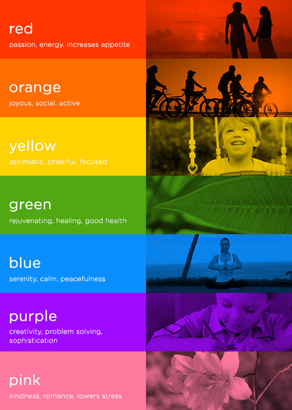
Red is energetic, exciting, intense, warm, comforting, bold, powerful, and typically associated with passion. Red can increase your heart rate and respiration. This makes it a great choice for lingerie, clothing worn on a first date or date night (salsa dancing, anyone?). Use it on walls in a kitchen or bedroom, but be careful, as red is said to make people eat more. While red can encourage warmth and passion, it can also raise feelings of intensity.
Orange is associated with being attention-grabbing, active, energetic and social. Good choice for workout clothing. In decorating, use a pop of orange in a living room, dining room, children’s room, or conference room to encourage more activity and interaction.
Yellow is associated with cheerfulness, optimism, energy, focus, and happiness. That makes it a great choice for workout clothes, offices, and dimly-lit spaces like hallways. Yellow can be visually fatiguing, so it’s best used in moderation in decorating. Worth noting: one study shows babies cry more often in yellow rooms, so it’s not the best choice for the walls of a nursery. Yellow also reflects the most amount of light, so using it behind screens in an office or media room can cause eye strain.
Green is calming, rejuvenating, and associated with good health, stress relief and healing. Try painting a bathroom, nursery or bedroom in shade of green. Or put splashes of green throughout your entire house! Green is also the color people are able to be around the longest without feeling overwhelmed.
Blue is calming, serene, and tranquil. Blue is also said to lower blood pressure, and slow respiration and heart rate—making it a great color for a space where you practice yoga, sleep, or anywhere you want to unwind. Great for yoga or meditation space, bedrooms and bathrooms. Some studies have shown people are more productive in blue rooms, but too much can also cause feelings of sadness. It's supposed to be the least appetizing color, so some weight loss plans recommend eating off of blue plates.
Purple is associated with royalty, sensuality, wisdom, creativity, problem solving, and ambition. Great color for an office, classroom, conference room, or kids playroom. Another great lingerie choice (especially in the warmer/ more red hues), or wear purple to a business meeting or when working on collaborative or creative projects. We think it's the perfect color for our store (don't you?).
Pink is a joyful, romantic, soothing color that is said to help insomnia and lower stress. Great color for a bedroom or nursery.
Graphic from Honest
